I’ve seen a lot of commentary over the last few years from both nadeo and trackmania players about what the design of different maps focus on such as campaign or tmgl/tmwt maps, often referring to viewers being important or new players being important or something else. However, the design decisions never really seem to align with either of these goals, especially the latter. In this post, I will propose an alternate model/reason for why nadeo makes the design decisions they do, that I think explains more accurately their actions.
First of all, when I say nadeo here, I am not referring to all of nadeo obviously, but specifically whoever is in charge of making the design decisions for maps and extending those ideals down the chain. I do not know however, exactly who it is in which situations, it is reasonable to assume that someone like hylis who has been outspoken about such topics and is the ceo likely is involved, and in the case of tmgl and some other official events I know it is mainly softyb, but I cannot speculate beyond that. It is possible there are a few others, but I do not know. I do know for almost certain that the vast majority of the mappers (who are not employees of nadeo but picked up from the community) do not and would not follow the design trends seen in official maps on their own. I will not go further into this here because it would take too long. I make these points not to try to say that certain people in specific are wrong or whatever, but to illustrate that when we as players are referring to nadeo design decisions on maps, it is likely to be more often than not a top down overall design goal coming from at most a few different people.
Now, here is the theory: nadeo is not optimizing for viewer experience or the quality of experience of new players, but instead especially with campaign optimizing for making the idea of playing the elements in the maps captivating (as opposed to how they actually play, for good or inexperienced players). In TM Theory - Nadeo Campaign Issues Disambiguated I pointed out a number of questionable map designs that are poor for both good and bad players. A couple examples from there:
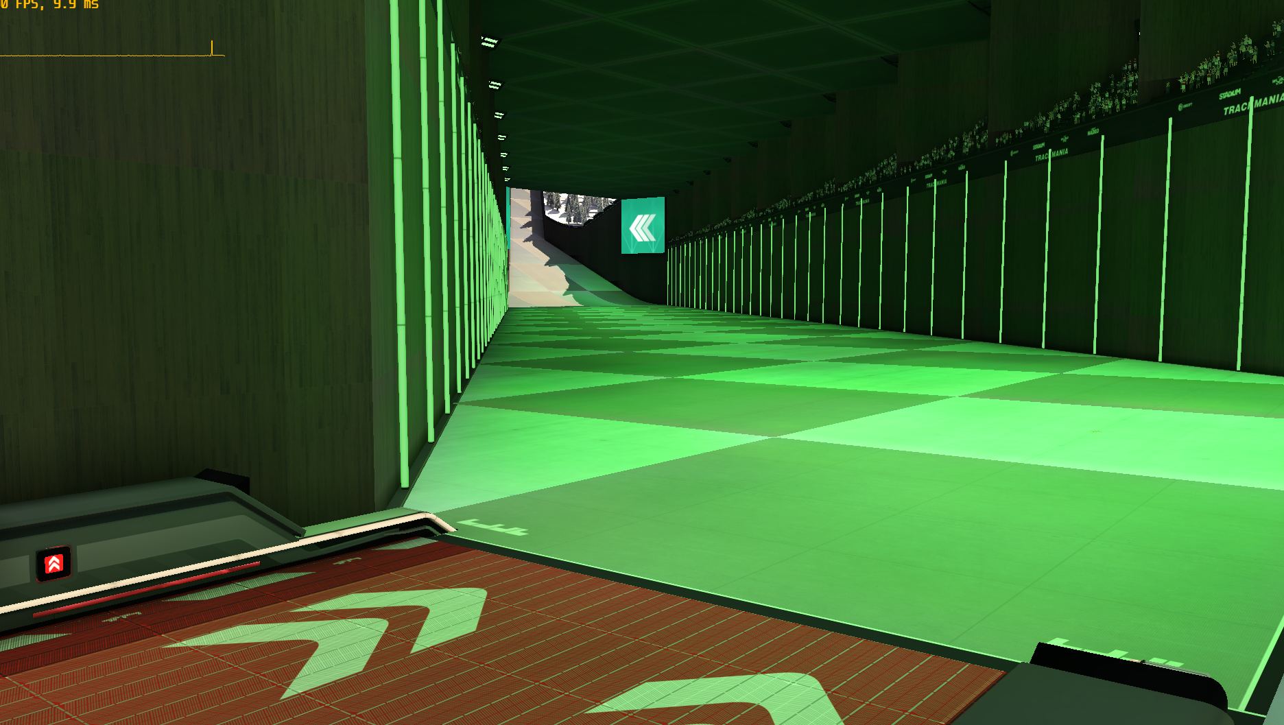
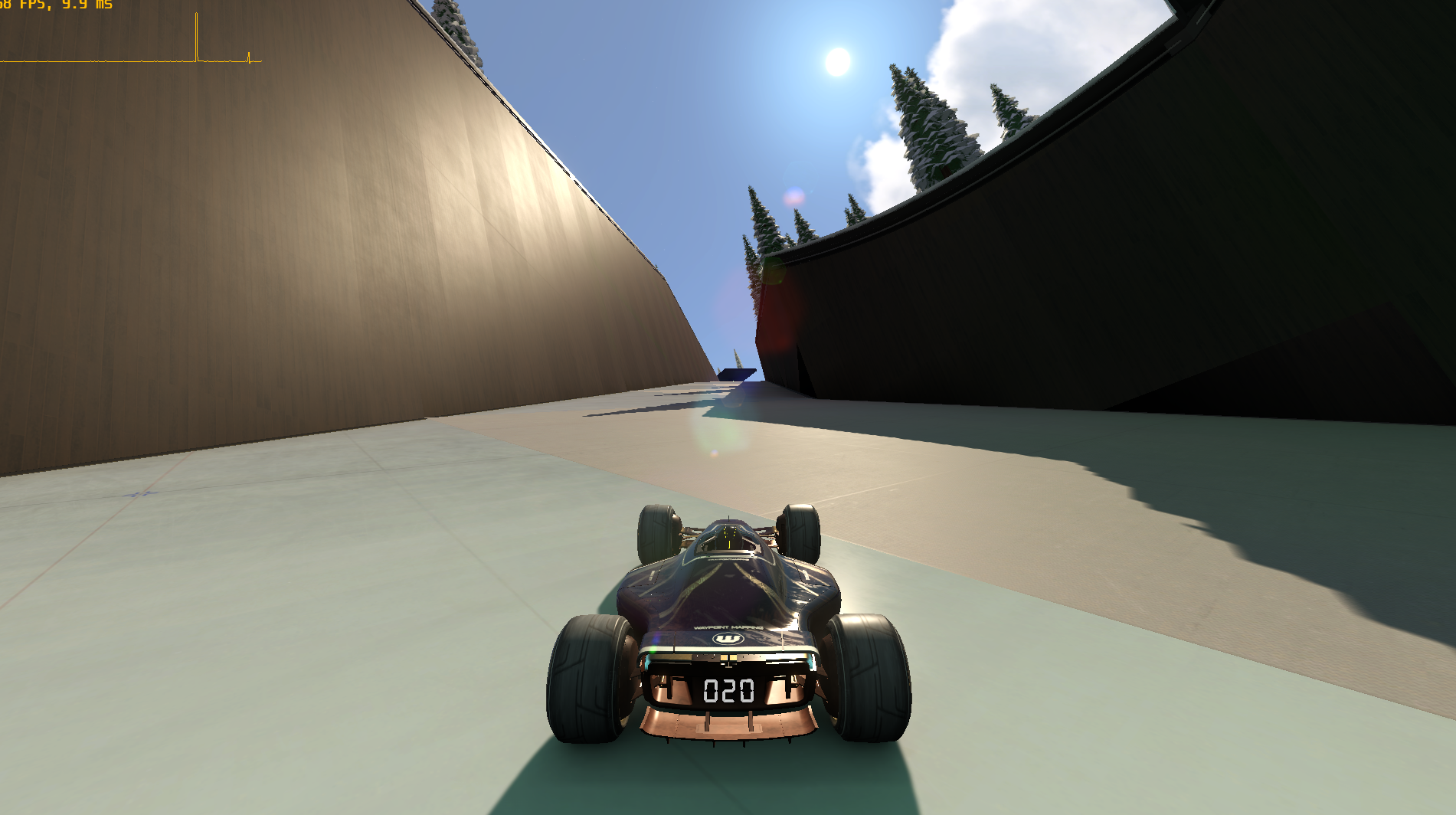
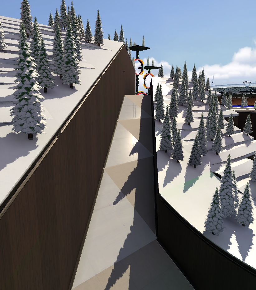
The end of map 25 [of the spring 2023 campaign] is also… questionable. It consists of driving at extremely high speeds onto a checkerboard pattern of ice and tarmac platform blocks. Because of this, the grip is constantly changing and you need to try to avoid the ice to keep some semblance of control over your car. After this long straight, you need to jump blind into one of a few finish lines. If you are a new player, it’s going to be difficult to figure out what the fuck is going on, and difficult to hit the finish without crashing because you can’t see it. If you are a good player, you are going to be asking why there is this long ass straight line at the end, why it’s filled with random ice blocks, and why you need to try to jump blindly into the left edge of this finish ring, as the left side is closer so it’s going to be faster except you can’t actually see it.
{According to ender’s sources, hylis allegedly built map 25. It is, notably, the first campaign made after hylis returned from vacation / administrative leave / not entirely sure for 2 years.) I have no way of confirming or denying whether he made this map or any campaign maps, but since it is a rumor going around I figured I would mention that I don’t think it has a significant impact on the point of this post, for the reasons I described in the second paragraph.}
Example 2: There are also a number of campaign maps that use this gimmick of placing a whole bunch of finish rings.
Summer 2023 map 15:
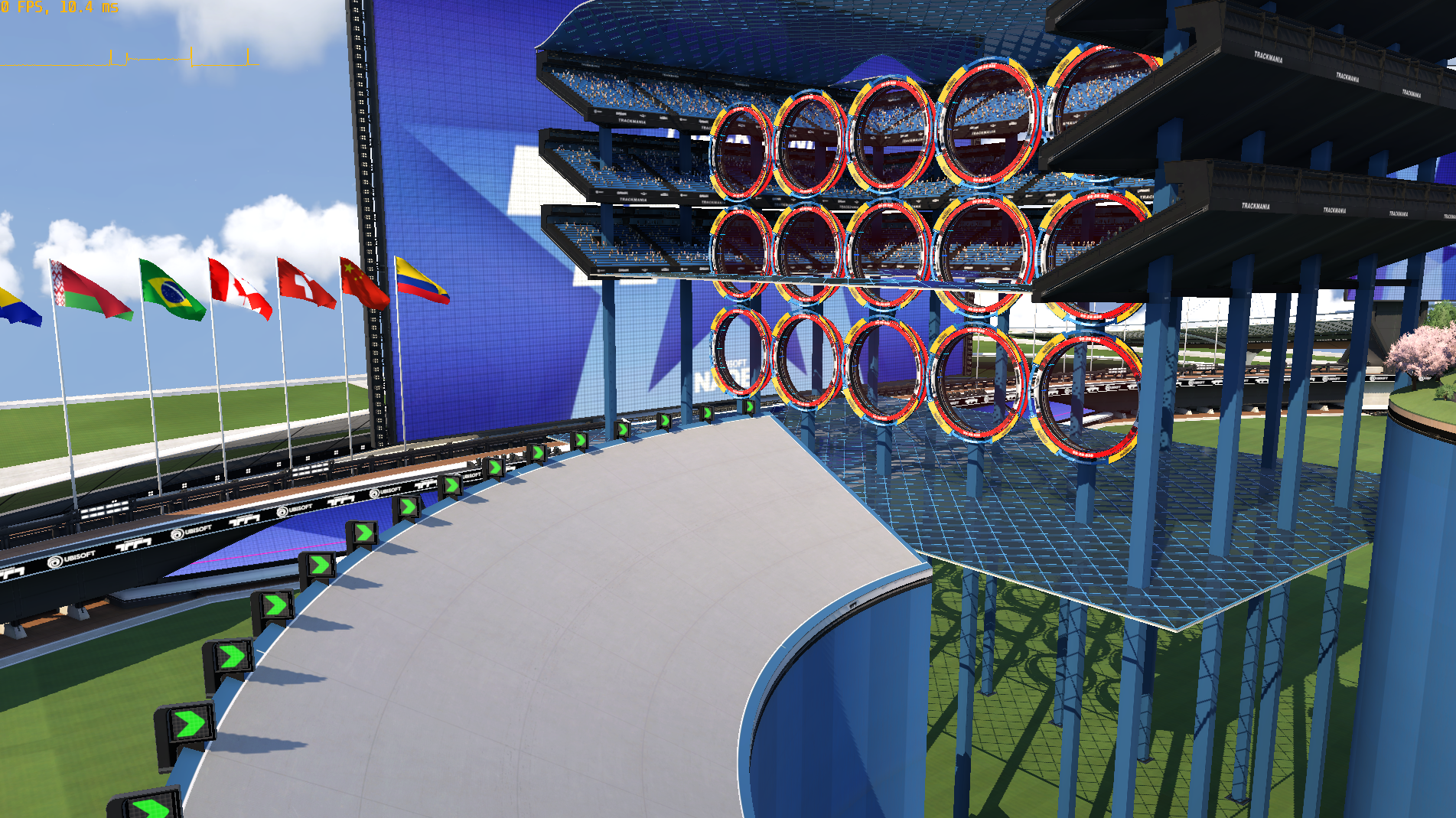 Summer 2023 map 18:
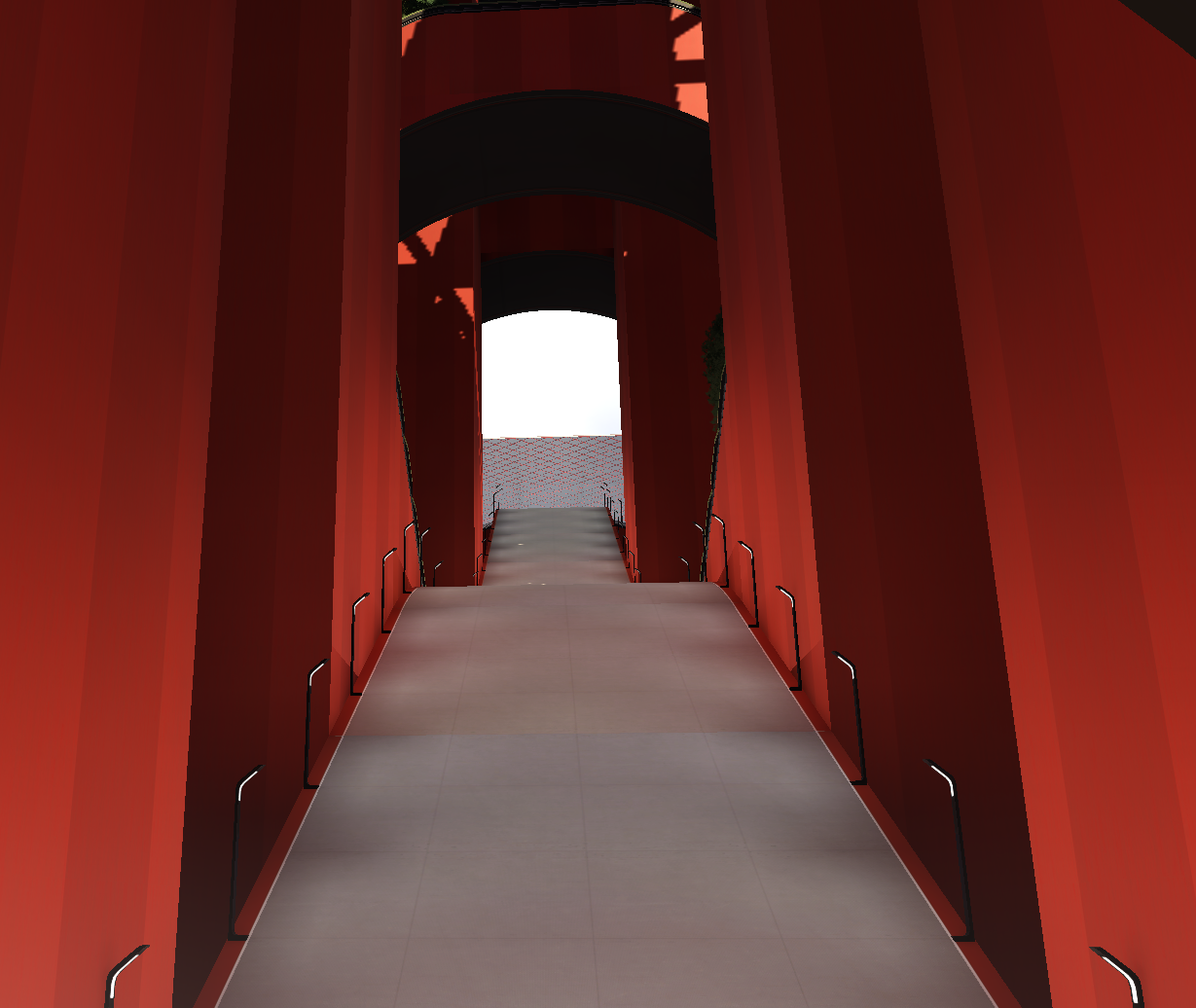
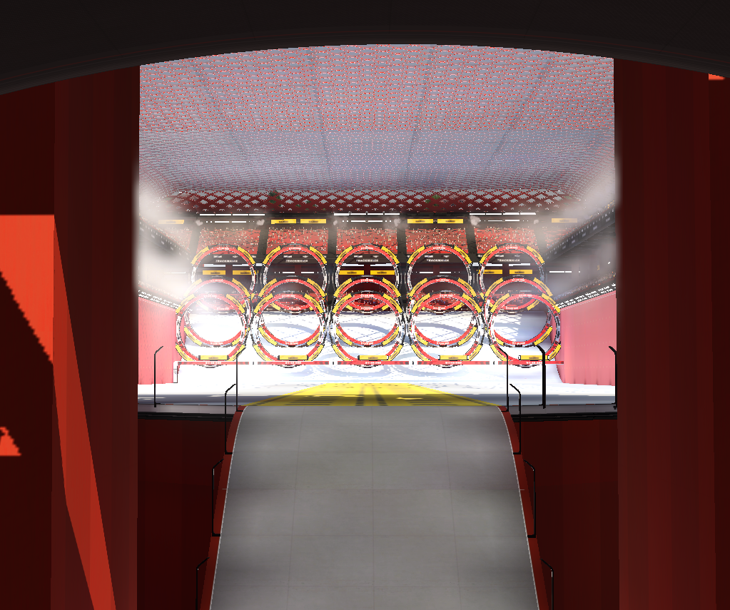
Map 15 has a bunch of finishes at a weird angle, it is unclear why there are so many other than that it creates uncertainty in what the best line is. Map 18 is far more egregious, because the finishes are after a huge jump. There are 2 main issues with here. 1: If one finish is too hard to aim for and you need to add more to make it more likely for the player to hit one, then how can you expect players to aim well enough to miss the gaps? 2: depending on the speed you are at on the jump, you can just get scammed by being at the wrong height where there is no finish you could enter even if you aimed properly, or at least it is exponentially more precise. I will note that along with this campaign they added finish blocks that can be tiled to create one large finish, and that the campaign maps can and do use the new blocks added in the update that comes with the campaign, so they had access to them. (Also, even if they didn’t, there is the obvious solution of just placing one finish line in a spot that is easier to aim for and see.) Again, obviously none of this is ideal for players who are bad at the game or good players (as it is often uncalculated, although not always, this is primarily an issue for newer players but it does not improve the experience for and has a higher than normal risk of ruining it for good players, is what I am trying to say).
Now, why would nadeo make anything like these examples? Or 2 bumpy road loops in a row, or some goofy reactor flight section where you flip half the time? It doesn’t make sense for players of any experience or skill level. The real reason: these things are interesting in theory! If you were to just sit down and think about the idea of playing a racing game with this stuff, it may seem novel and certainly has a specific vibe. Nadeo is not optimizing for the actual experience of new players playing these maps, or viewers viewing them, or good players hunting them for 3 months, or players playing them in matchmaking or tournaments, because they are optimizing for the idea of playing them, not actually playing them.
At least, that’s the theory. I have no idea what is actually going through the minds of the nadeo employees making these decisions, but this motivation seems to explain why they do the things they do better than just ‘it’s for the console players!!!’, or any other motiv provided by nadeo or the players base, in my opinion.
More: TM Theory